


When it comes to ecommerce, the big names aren’t just winning because of budget or brand recognition, they’re winning because they understand what makes their audience tick. Glossier, Nike and Gymshark are three global brands that have cracked the code on how to blend design, UX, community and conversion into ecommerce experiences that actually work. So what can smaller brands learn from them? Let’s break it down…
Glossier
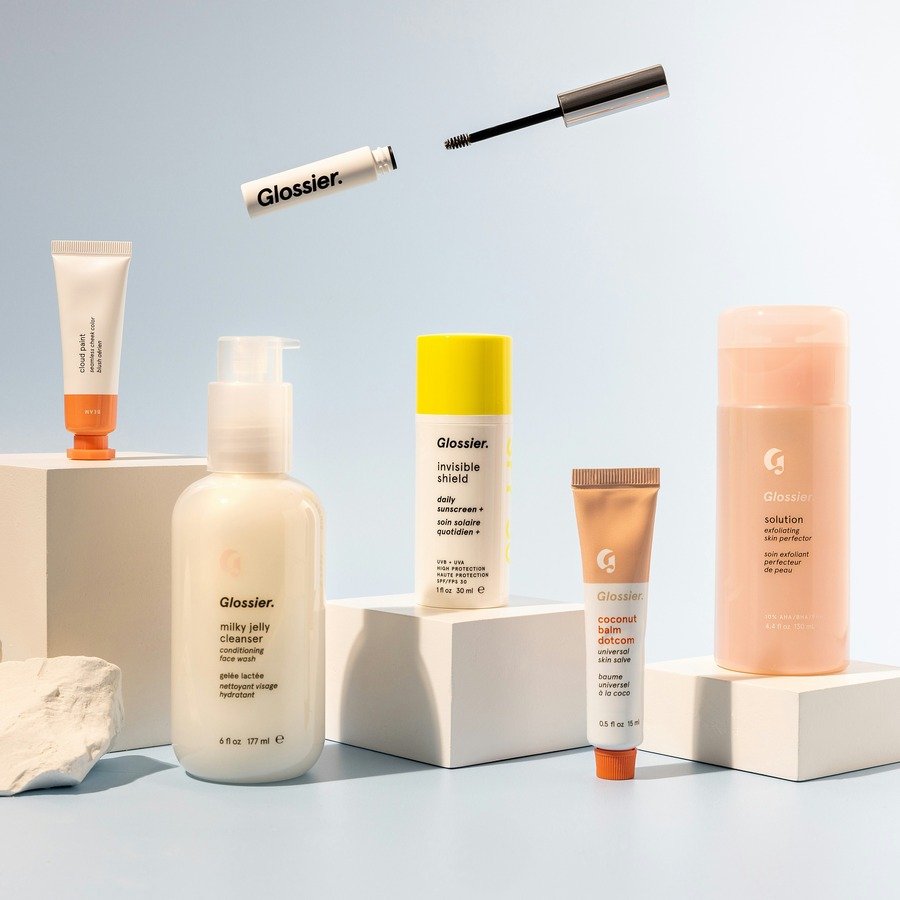
Like many leading beauty brands, Glossier’s ecommerce success is rooted in how well it understands its customers. Rather than relying on overly-polished marketing, Glossier built its business by listening to and showcasing its customers and sharing how they actually use Glossier products. From customer reviews to unfiltered selfies, the Glossier website is full to the brim of content that feels genuine, authentic and relatable. It’s a seamless extension of the social-first, community-driven brand built on social platforms like Instagram and TikTok.
Product pages don’t just display features and benefits, they host glowing reviews, real-life UGC and tips from verified customers, making the purchase journey feel collaborative and supportive. The tone of voice and language used is accessible, conversational and never pushy. Everything about the site says, ‘you’re already part of this,’ and that feeling builds trust, fast!
For smaller brands, the takeaway is simple: Make your audience the core of your brand story. Whether it’s through customer reviews, testimonials or UGC on your product pages, find ways to let your community speak for you. The more human your website feels, the more likely customers are to stick around and convert.
Nike
Nike has mastered the art of personalisation without making it feel too much. From the moment you land on their ecommerce website, users are served content tailored to their unique interests, whether it’s new releases, recent browses or location-based offers. But what really makes Nike stand out is how fluid the online shopping journey feels. There’s never friction points or overwhelm, just a confident, user-led experience and flow that makes purchasing almost subconscious for users.
One of the most successful elements of Nike’s approach is their customisation tools. Users can design their own trainers or apparel directly within the site. It’s not just a fun gimmick, it truly gives people a sense of ownership over their purchase and differentiates the brand from the competition. This interactivity deepens brand engagement while increasing AOV. Combined with a fast, mobile-first design and beautifully structured, robust navigation, Nike’s site is a case study in how to make personalisation work with the user, not against them.
For growing brands, personalisation doesn’t have to be complex. Simple things like showing related products based on browsing behaviour, remembering a user’s previous size or sending abandoned cart emails with helpful nudges can create the same sense of relevance. The key is anticipating your audience’s needs before they’re spoken!
Gymshark
Gymshark’s site is a masterclass in blending bold branding with conversion-focused functionality. Every touchpoint, from the homepage to the checkout process, reinforces Gymshark’s brand identity. Bold typography, high-impact lifestyle imagery and a stripped-back colour palette work together to create a visually memorable experience. But behind the aesthetics is a smart CRO (conversion rate optimisation) strategy that supports fast, intuitive shopping.
Their product pages are clean and informative, with clear size guides, strong CTAs and mobile-friendly layouts that don’t feel cramped. Navigation is straightforward, filters are very responsive and the checkout process is lightning fast. More importantly, the Gymshark ecommerce website doesn’t overload you with information; Each section of the site feels purposeful, not just designed to look good, but to guide customers clearly and confidently toward making a purchase.
The key lesson for smaller ecommerce brands? Don’t underestimate the power of simplicity. If your site is cluttered, slow or inconsistent, customers won’t wait around to figure it out. Prioritise speed, usability and visual harmony, especially on mobile and invest in design that supports conversions, not just impressions.
What You Can Learn From These Brands
While Glossier, Nike and Gymshark operate on very large, global scales, their ecommerce success comes down to shared, timeless principles: Community-first storytelling, seamless personalisation and conversion-focused web design. They each understand that ecommerce isn’t just about displaying products, but rather creating trust and delivering a digital experience that feels easy, exciting and entirely user-centric.
You don’t need a multimillion-pound budget to apply these strategies. In fact, being a smaller brand gives you the advantage of agility! You can test, refine and implement faster, so be sure to take inspiration from the giants, but stay true to your own identity.
By investing in a website design that does more than look good but actually guides users confidently from product discovery to purchase, you’re on your way to success! And if you need help crafting a site that blends design with performance? Don’t hesitate to get in touch!


