


Subscription ecommerce is booming, but it’s also an extremely competitive industry.
Getting visitors to commit to a recurring payment means your ecommerce product page needs to be crystal clear, packed with persuasive messaging and free of friction points that could deter users from checking out. We’ve gathered 10 excellent subscription box product pages that excel at capturing users’ attention and encouraging them to convert. Without further ado, let’s’ dive in!
1. Birchbox: Beauty Subscription Box
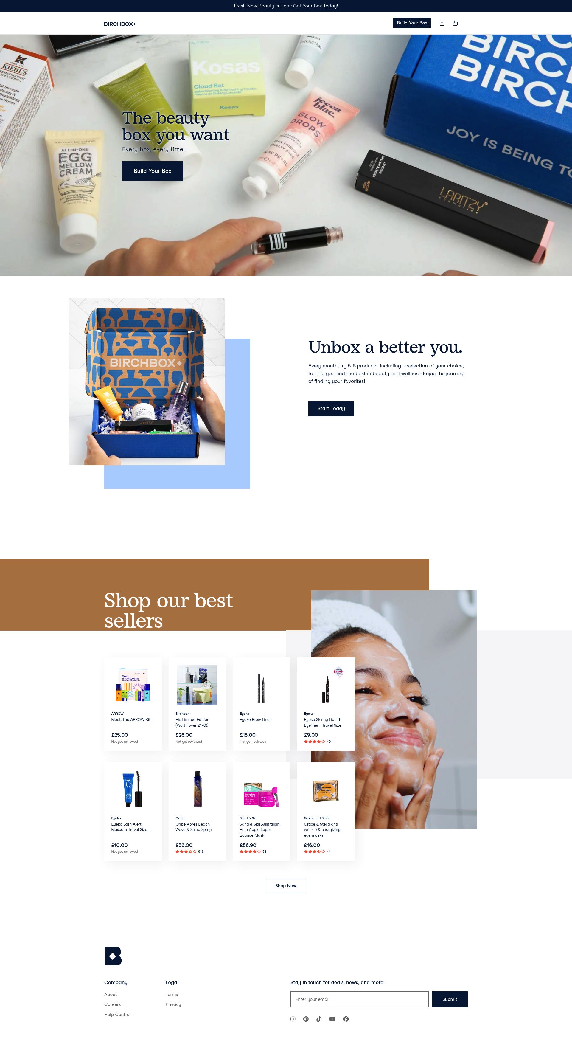
Birchbox is a beauty brand rooted in simplicity, everyday essentials and accessibility. The brand’s ethos is to enable access for everyone to get great products delivered directly to their door on a monthly basis. Birchbox allows customers to build their own box and choose from multiple subscription tiers right from the ecommerce product page. The design caters to various budgets and user intents by utilising personalisation and clear choices, all hugely important factors in terms of converting beauty‑focused subscribers.
Standout features:
- Subscription tiers are clearly outlined plans with straightforward monthly billing make it easy to choose
- Discounted rates for longer subscriptions encourage longer‑term commitment
- Strong UX design ensures users can quickly view various subscription options
2. Purdy & Figg: Eco‑Friendly Home Starter Kit

Purdy & Figg is a brand aiming to re redefine the cleaning industry with sustainable, non-toxic households products. Their product page converts extremely well by leading with a strong value offer (both a discount and free extras) and clear recurring order terms. Users immediately see the benefit of subscribing for ongoing refills rather than one‑off purchases, with three scents delivered every three months and the option to pause or cancel anytime. A simple but welcoming web design ensures that users aren’t distracted by tons of messages and buttons other than those required to sign up to the subscription.
Standout features:
- Simplistic, minimal UX design reduces distractions and friction points
- Value and convenience is demonstrates up front with discount and subscription frequently clearly displayed
- Features strong customer reviews that instil trust
3. GLOSSYBOX: Monthly Beauty Box
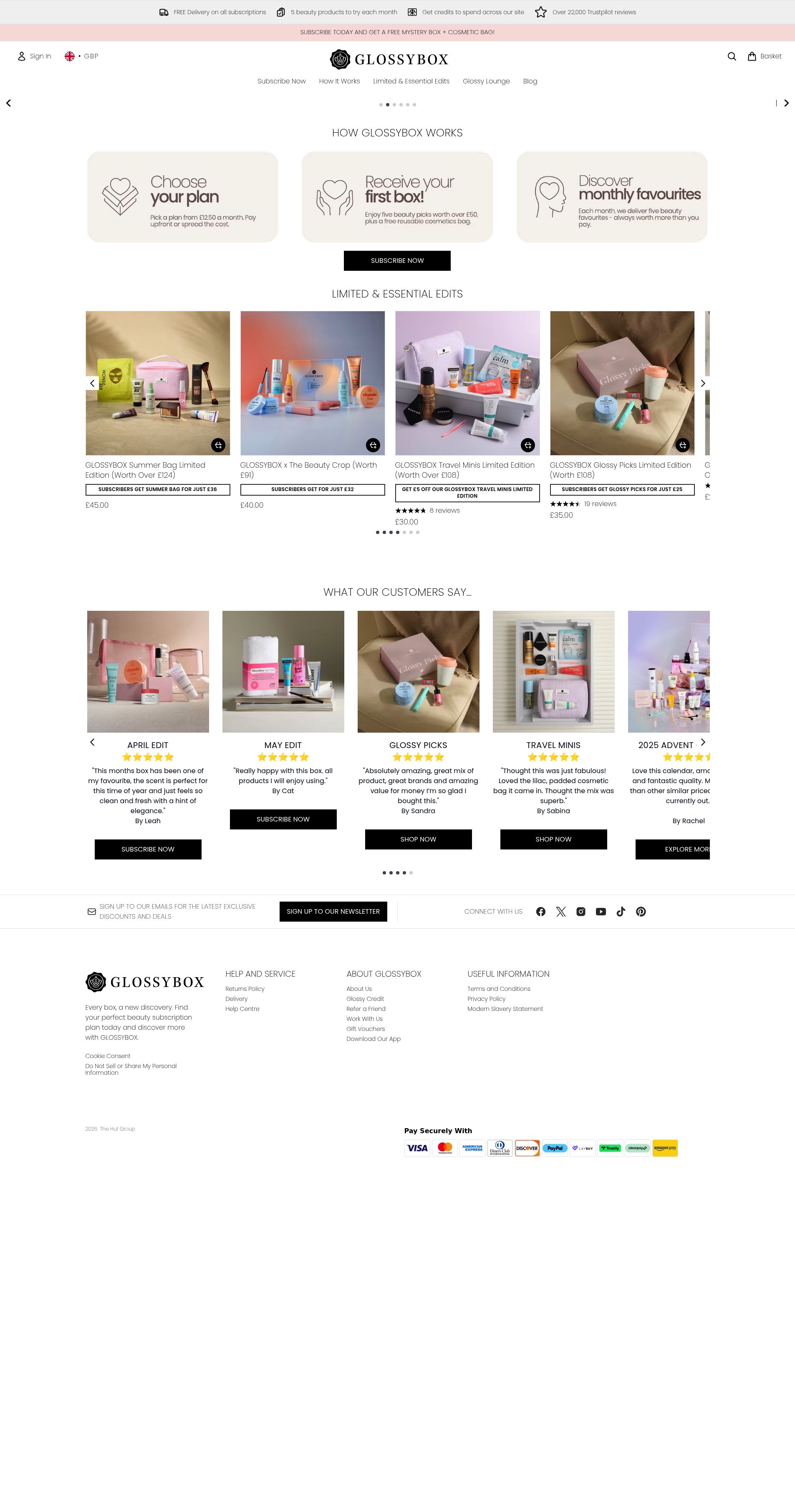
GLOSSYBOX is a monthly beauty subscription service offering curated boxes of sample and full-size beauty products. Their product page converts extremely well by leading with the perceived value of the box (worth over £50) compared to the subscription price, while also highlighting verified customer reviews. Options for either month-to-month or prepaid plans allow users to have flexibility over their subscription and strong product photography communicates the excitement of receiving a curated box each month. A minimalistic web design style featuring iconography to highlight how the subscription works alongside prominent CTA’s ensures the page converts.
Standout features:
- Perceived value is high as boxes contain products worth £50+ but the subscription price is approx. £13-£17
- High-quality product photography and video give a real sense of what subscribers receive.
- Additional purchases for full-size products seamlessly integrated, providing upsell opportunities
4. Fussy: Deodorant & Toiletry Subscriptions
Fussy is a wellness and lifestyle subscription brand delivering tailored product boxes designed to simplify daily routines. Their product page converts exceptionally well by letting users personalise their box with limited edition cases and clear subscription tiers within a multi-step form. While discounts for longer commitments and simple month-to-month options make subscribing feel low-risk. The web layout is clean and uncluttered, with strong CTAs that guide users effortlessly toward sign-up.
Standout features:
- Straightforward subscription tiers with clear pricing and plan lengths
- Extensive personalisation options boosts perceived value
- Minimalist UX design ensures visitors focus on the subscription offer
5. Bloom & Wild: Flower Subscription Boxes
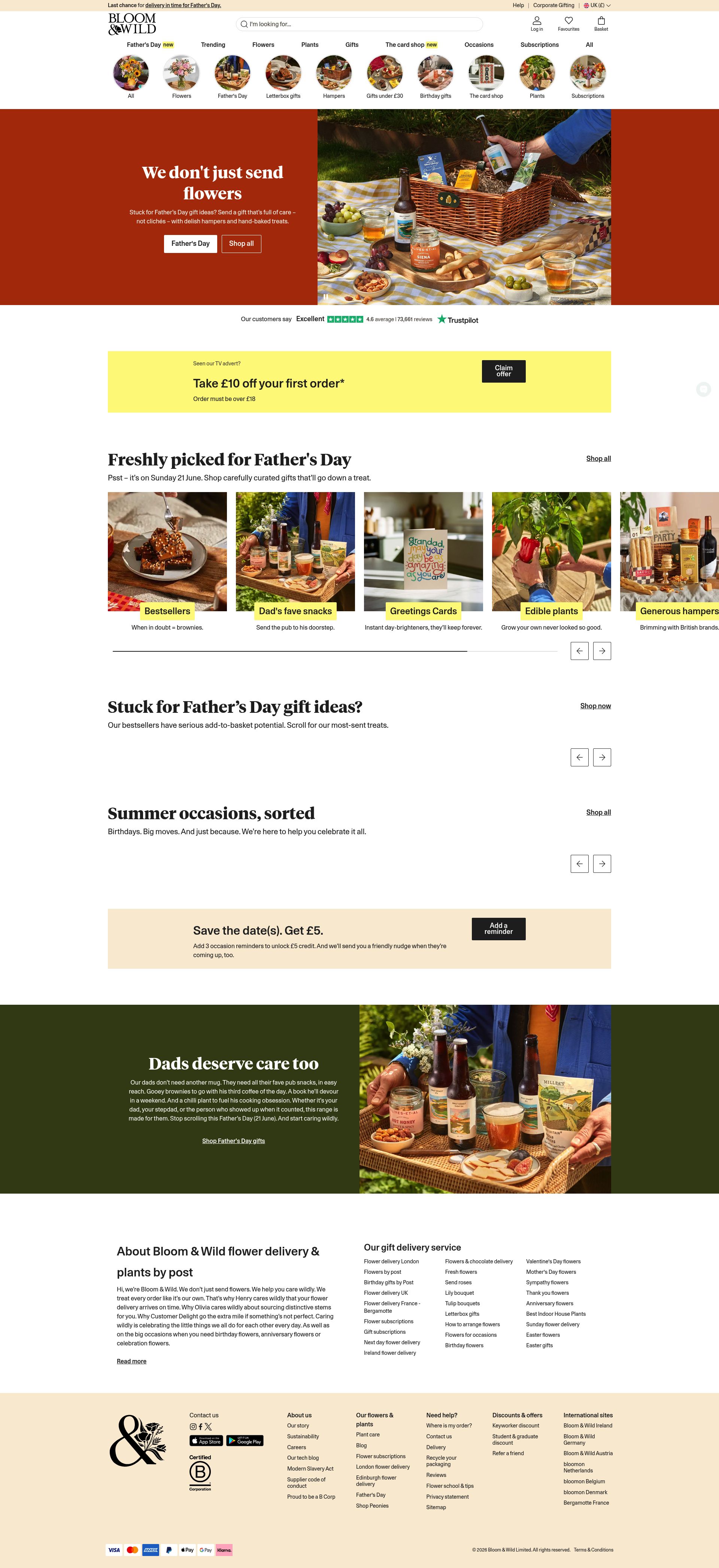
Bloom & Wild is a flower subscription service delivering fresh blooms with flexibility and emotional appeal. Their product page converts well by combining clear subscription options (3, 6, 12 months or month-to-month) with evocative messaging about the joy of receiving flowers. High-quality bouquet photography, simple pricing and visible savings for longer commitments make the page compelling, while CTAs remain easy to find and use.
Standout features:
- Flexible subscription plans allow users to choose commitment length
- Emotional messaging and visuals create a strong lifestyle connection
- Pricing and savings clearly displayed to reduce friction
6. Look Fantastic: Monthly Beauty Box

LOOKFANTASTIC delivers a monthly beauty box subscription with a focus on flexibility and rewards. Their product page converts effectively by showcasing multiple plan lengths alongside perks like loyalty points, free delivery and exclusive gifts. High-quality imagery and concise, scannable copy make it easy for visitors to understand the offer quickly. Simple CTAs above the fold guide users directly toward subscribing.
Standout features:
- Multiple subscription lengths and prepaid plans clearly presented
- Perks like loyalty points and free delivery enhance perceived value
- Clean layout with strong CTAs ensures effortless sign-up
7. Bird & Blend Tea Co: Tea Tasting Boxes
Bird & Blend Tea offers a curated tea tasting subscription club, appealing to tea enthusiasts and focusing on education and curation.Their product page converts strongly by guiding users through the subscription process step-by-step, showing box options and delivery frequency clearly. Testimonials from happy customers add trust and the design is clean and uncluttered.
Standout features:
- Step-by-step explanation of subscription process reduces uncertainty
- Multiple box and flavour options for personalisation
- Social proof via testimonials builds credibility
8. GRIND: Coffee Subscription

GRIND delivers premium coffee subscriptions with a focus on quality and freshness. Their product page converts effectively by highlighting bean origin, taste profiles, and delivery frequency. Options for weekly, bi-weekly or monthly delivery make the subscription flexible, and strong lifestyle imagery reinforces the brand’s premium positioning.
Standout features:
- Emphasis on freshness and bean origin communicates quality
- Flexible delivery intervals cater to different consumption patterns
- Clean UX and strong visual storytelling reduce friction
9. KiwiCo: Kids’ STEM Subscription
KiwiCo is an educational subscription box for children, offering STEM-based projects. Their product page converts extremely well by segmenting boxes by age and theme, so parents can quickly select the right box for their child. Developmental benefits are highlighted to show value beyond the products, while bright, engaging visuals draw attention.
Standout features:
- Age and theme segmentation simplifies decision-making for parents
- Developmental outcomes highlight educational value
- Engaging visuals and clear CTAs enhance usability
10. Whittard of Chelsea: Tea & Coffee Boxes
Whittard of Chelsea offers recurring tea and coffee deliveries with convenience and flexibility. Their product page converts strongly by showcasing familiar products, explaining subscription management (pause, swap, cancel), and emphasising the ease of never running out of favourites. High-quality images and a clean layout make the subscription appear premium and effortless.
Standout features:
- Multiple blends and flexible delivery options for personalisation
- Clear benefits and pricing reduce friction
- A simple ‘ship every X weeks’ drop down menu enables users to have full control
The most successful subscription product pages share the common traits of clearly communicating value and benefits, offering flexibility, highlighting perks and make it extremely easy for visitors to commit. Whether you’re in beauty, fashion, food, lifestyle or education, the key takeaway is to design with the subscriber in mind. Simplify choices, emphasise value and use social proof and personalisation to build confidence. Small UX tweaks such as clear pricing, visible subscription intervals or straightforward CTAs can dramatically increase conversions.
By studying these standout examples and applying their principles to your own product pages, you can create a subscription experience that’s not just functional, but irresistible to your customers. Need a helping hand optimising your subscription pages? Don’t hesitate to get in touch!


