


Selling products as a charity or nonprofit is a delicate balancing act.
You’re not just selling stock, you’re raising funds, building awareness and connecting people to a cause they genuinely care about. And when you mix that with ecommerce, the stakes get much higher. The good news is that plenty of charities are already doing it brilliantly with thoughtful UX and lightning-fast checkouts, these organisations show that ecommerce can support a mission without compromising on usability, aesthetics or performance. Here are 10 charity and nonprofit websites absolutely nailing ecommerce…
1. WWF Charity
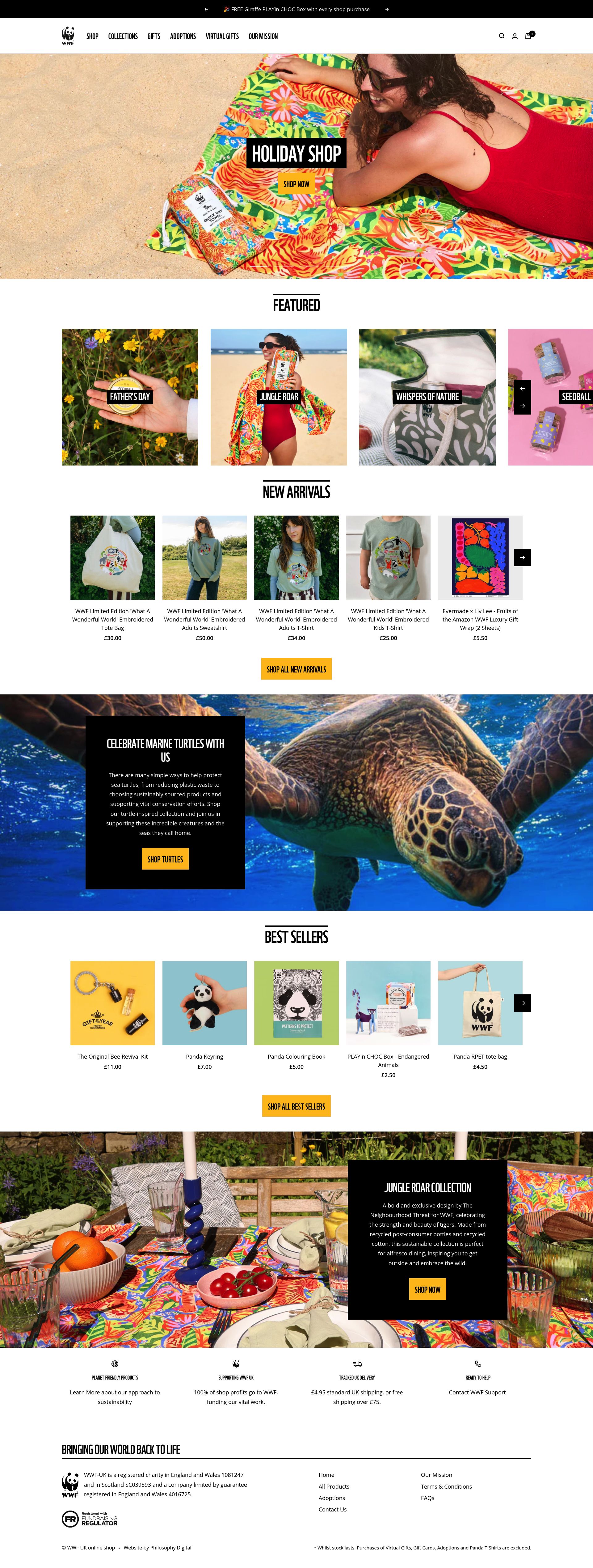
WWF’s shop feels exactly like the brand does; natural, calm and premium. Their clean layout and soft colour palette create a serene browsing experience, while the typography subtly elevates the products without drowning out the mission. Impact messaging is woven seamlessly into product pages, reminding users how their purchase helps conserve wildlife without ever feeling intrusive. Everything feels intentional, from the straightforward categorisation to the uncluttered mobile experience, making it effortless to shop with purpose.
2. National Trust
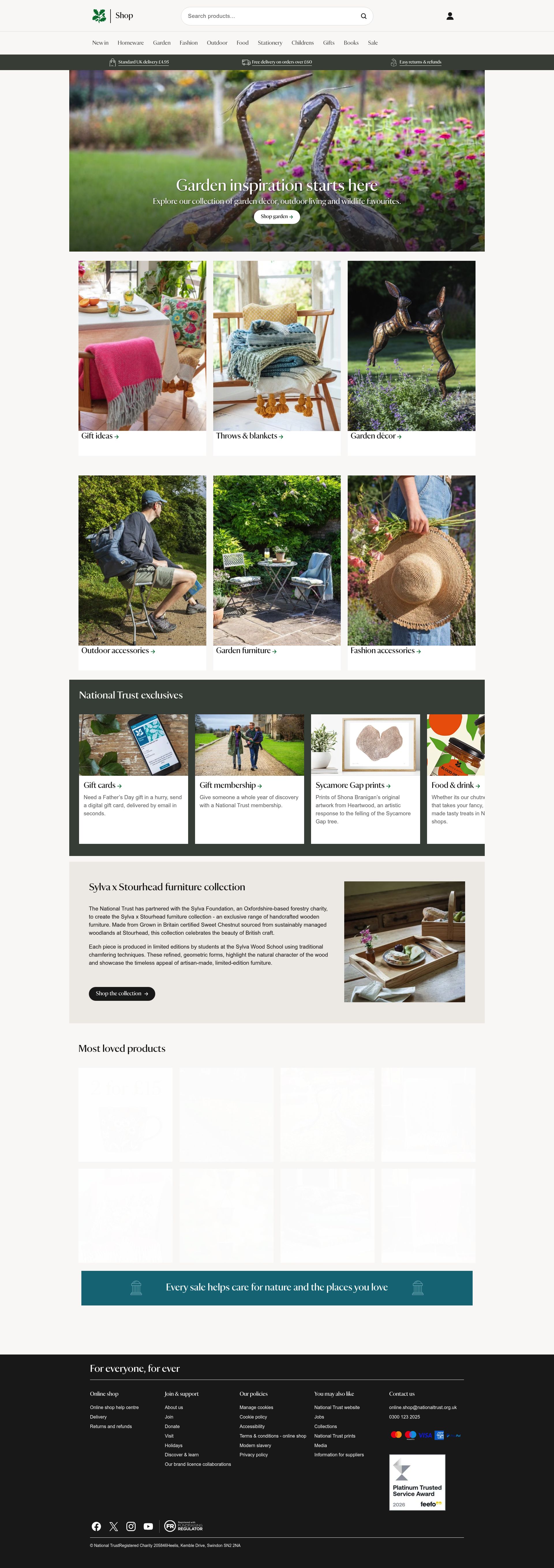
The National Trust shop blends heritage style with modern ecommerce design. It’s visually rich without being overwhelming and high-quality product photography gives everything a timeless, craftsman-like quality. Navigation is excellent, considering there’s such a large catalogue of homeware, gifts and food items, everything is broken down into intuitive sections that never overwhelm the user. Seasonal edits and curated collections are presented in a genuinely helpful way, guiding browsing rather than dictating it. It’s a polished, premium experience that still feels warm and deeply in line with the iconic National Trust brand cherished by its audience.
3. Dogs Trust
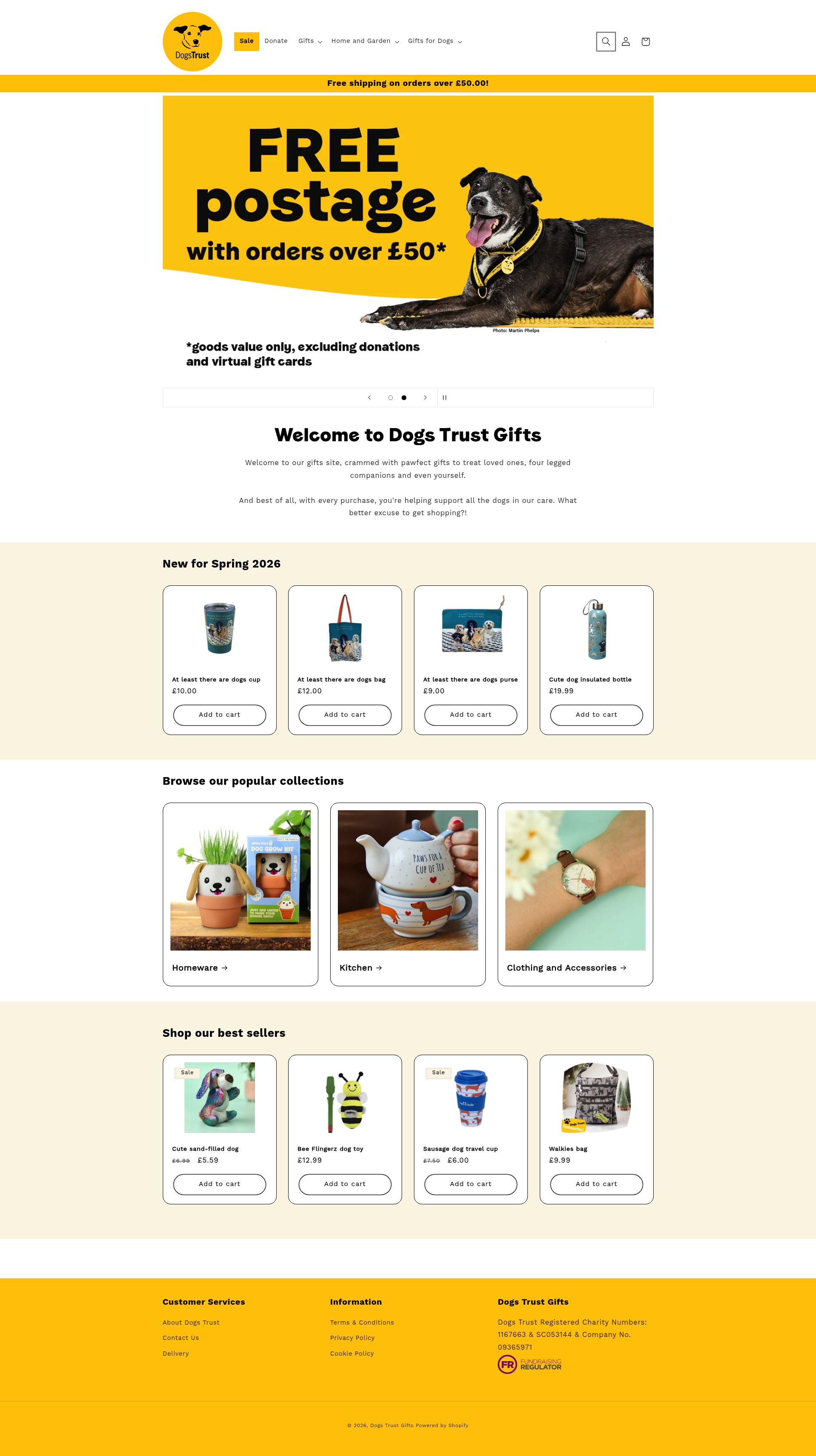
Dogs Trust delivers one of the most joyful charity shopping experiences out there. From the sunny yellow palette to the friendly product imagery, everything feels uplifting and full of personality. The design doesn’t try too hard, it’s honest and simple, which suits the brand perfectly. Their merchandising is pretty nifty too, featuring gift ideas, dog-owner essentials and seasonal products grouped in ways that feel logical and genuinely useful. Combined with clear calls to action and a breezy checkout, it creates a shopping journey that’s every bit as positive as the cause itself.
4. Oxfam
Oxfam’s online store is a huge undertaking, offering secondhand items, ethical brands, books, vintage clothes and more. But the site handles the complexity with impressive clarity. The design is modern, bright and unmistakably Oxfam, and the structure makes a vast product range feel surprisingly manageable. Strong filters and consistent product cards bring order to an otherwise diverse catalogue, while secondhand clothing is presented with the kind of polish you’d expect from a dedicated fashion marketplace. It’s a brilliant example of how thoughtful UX can elevate donated items into a desirable, trustworthy offering.
5. RNLI

The RNLI shop exudes confidence and trust from the moment you land on it. Crisp blues, clean typography and clear structure all reinforce the organisation’s professionalism. The photography, much of it featuring real crew members, gives products a sense of purpose that goes beyond retail and is extremely high-quality. The layout feels spacious and calm while the navigation is kept reassuringly simple, which helps users find what they need without effort. It’s a mature, credible ecommerce experience that supports the seriousness of the charity’s work while still feeling welcoming.
6. British Red Cross
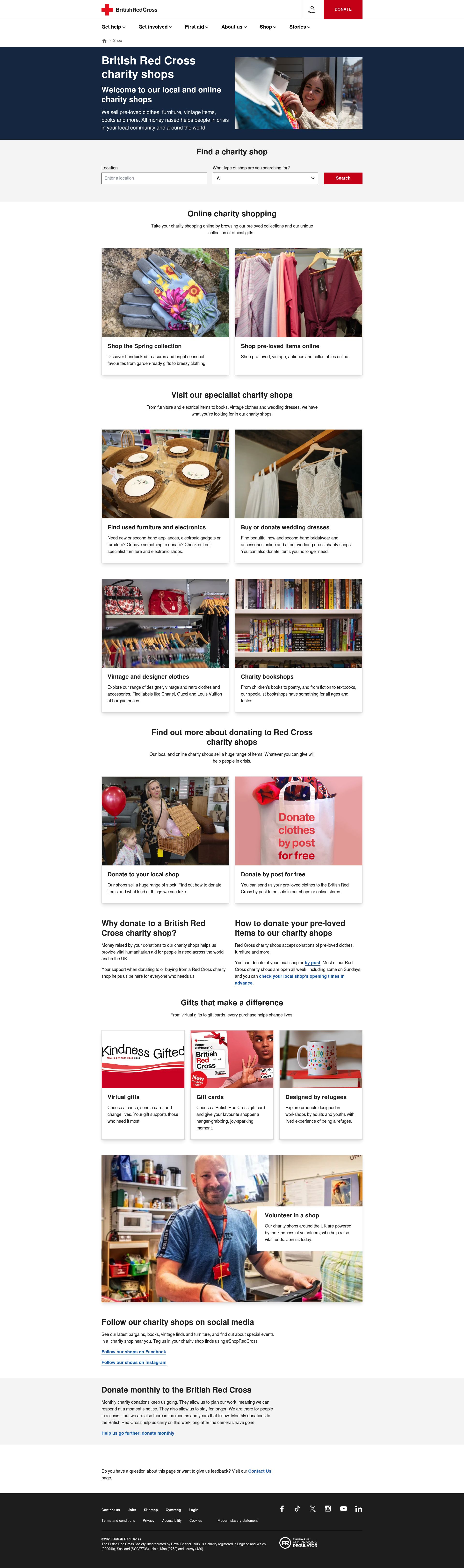
The British Red Cross shop keeps things clean and streamlined, letting its bold brand red do most of the talking. The minimal design makes browsing easy, fast and distraction-free and the straightforward categorisation works brilliantly for users who simply want to purchase essentials, kits or thoughtful gifts. The site’s restraint is what makes it strong, no over-styling, no unnecessary content, just a clear, confident shop that feels instantly trustworthy, professional and true to the organisation’s global reputation.
7. Woodland Trust
The Woodland Trust shop is a beautifully calming experience, with earthy tones, gentle typography and nature-inspired photography that all work together to create a sense of tranquillity. The design feels purposeful rather than stylised, it lets the products breathe, much like the woods the charity protects. Adoption packs, gifting experiences and fundraising products are presented with clarity and kindness, making them easy to understand even for first-time supporters. It’s a lovely example of an ecommerce site that carries its organisation’s values into every design decision.
8. Guide Dogs
Guide Dogs offers one of the most accessible charity shops online, both visually, structurally and practically. Every part of the design prioritises clarity: high contrast, readable typography, intuitive buttons and simple layouts that feel friendly without sacrificing usability. The photography adds warmth and charm, often featuring real dogs, which instantly builds an emotional connection. The whole site feels open and approachable, reflecting the organisation’s focus on independence, support and inclusivity.
9. RSPB
The RSPB shop brings personality and polish together with ease. Its bright palette and approachable design make the site feel lively but never chaotic. The structure is excellent, guiding users smoothly between homeware, gifts, binoculars and wildlife essentials. Product pages strike a great balance between educational detail and easy scanning, ideal for a charity whose audience often wants to learn as they shop. The mobile experience is extremely tidy and well considered, proving that thoughtful layout makes all the difference.
10. Muscular Dystrophy UK
The Muscular Dystrophy UK shop is refreshingly straightforward. Bright brand orange gives the interface energy, while the layout is kept clean and unfussy, making it incredibly easy to navigate. Product cards are simple but effective, and the overall experience feels light, fast and free from clutter. What stands out is the clarity of communication, users instantly understand how their purchase supports research and people living with muscular dystrophy.
And there we have it! Our top 10 ecommerce websites in the Charity Sector. Who says that charity websites need to be boring?! These 10 examples prove otherwise and demonstrate how successful they can be when executed right.


