


Even if you’re not moving house, it’s always fun to sit back and have a nose at all the properties on the market.
And odds are when you do so, you’re using Zoopla – one of the UK’s leading property sites that pulls hundreds of properties from a range of estate agents and pops them into one, scrollable feed.
As one of the nation’s most popular property sites, Zoopla is constantly trying to up their game and provide the best possible experience for their users both online and as they venture into the property market. And to make sure that they’re keeping things fresh and up to date, Zoopla has been working hard behind the scenes and has finally unveiled their highly awaited rebrand and redesign!
As web design and branding experts ourselves (not bias at all), we thought we take a little Limely look at exactly what their rebrand entails and bring to you our honest thoughts!
So join us in unleashing our inner web design geek as we take a closer look at the new Zoopla!
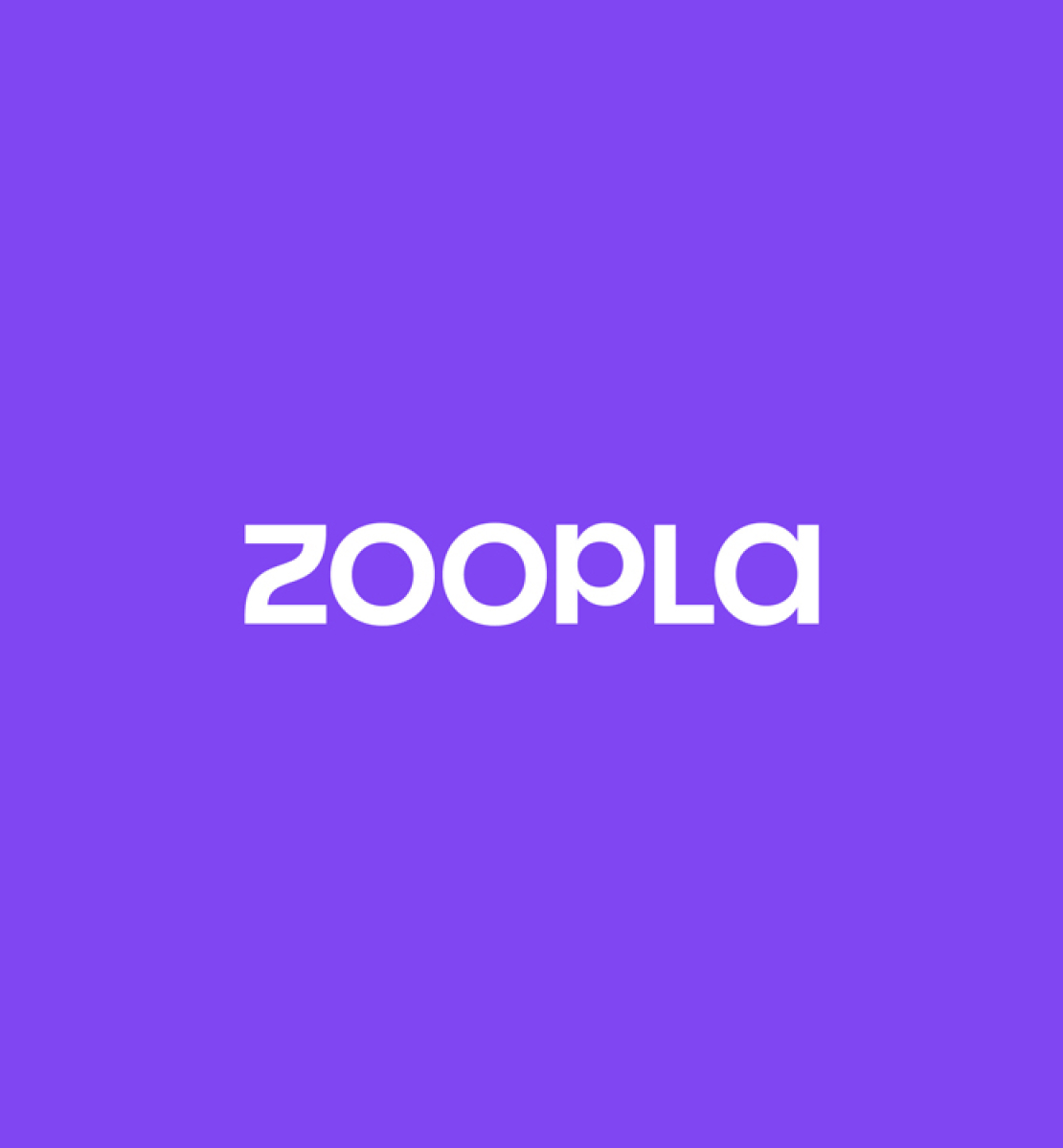
The new logo
From this…
To this!
So as you can see, Zoopla applied quite a drastic change to their main logo. They’ve had a change of typeface, as well as a switch-up of their iconic purple. Their new logo definitely seems to be a more contemporary and up to date version of the original; the colour change offering a fresher and brighter feel.
“We have built on our purple heritage, with a brighter, fresher tone for more cut through, and a darker more sophisticated one to connect to our more business-led audiences,” – Design Lead, Gabriel Weichert
As Weichert stated, their redesign has simply extended the use of their iconic purple palette in order to appeal to more of their diverse audience. Here at Limely, we’re always a fan of change, but know how hard it is to find a balance amongst your audience who have come to know and love your signature brand. In this case, Zoopla has certainly found the best of both worlds.
The new font that’s been applied to both their logo and the rest of the site was also not just an aesthetically motivated move. In an article that also delves into their rebrand, Weichert explains: “We wanted to ensure the Z was still unique on its own.” And by doing so, Zoopla has made their logo instantly recognisable just from one letter of their name and now, as desired, can be used across merchandise and as an additional way to spread the word of Zoopla.
And if you can’t tell already, we are a MASSIVE fan.
Journey Lines
One of the main features of Zoopla’s redesign, one that has got everyone so excited, is the concept of Journey Lines. This is in reference to their new style of typeface that is apparent across the site and their marketing content. This unique, bespoke font not only brings a unique edge to Zoopla’s new look but eludes to their goals, aims and brand ethics as one of the UK’s leading real estate company. The Design Director behind the font explains: “The way it moves and behaves was designed to visualise the home buying journey, and how Zoopla was the constant.”
Zoopla’s new Journey Lines is certainly something we’ve never seen before, and although it brings such a unique edge to their rebrand, we’re unsure how it will play out amongst their audience who might not get the connection. That said, we can’t resist a double meaning and would like to give an honourable mention to their level of creativity!
What are your thoughts?
Although Zoopla has achieved this great new look, they’ll still uphold their much-loved service and continue helping people like us find the house of their dreams. But after having such an iconic and recognisable brand, we’d love to know what you think about the change!
Let us know by dropping us a comment on our Instagram, Facebook, Twitter and LinkedIn!
Is your online business in need of a redesign? Well, there’s no better people to talk to than the design team right here at Limely! Click here to get in touch today!


