


Each month, our UX designer Tom is taking a real ecommerce website and giving it the full Limely overhaul.
Rethinking UX and demonstrating exactly how small design changes and tweaks can make a significant impact to the usability and success of ecommerce websites. There are no client briefs and no pitches, just a bit of fun, backed by UX design thinking with a focus on conversion rate optimisation (CRO). In this month's UX review, Tom takes a look at Pooky, a popular UK lighting retailer. As Tom loves design and all things interiors, he's perfectly positioned to spot exactly what works and what doesn't when it comes to shopping for new lighting fixtures online. Naturally, he already had a few thoughts on the site, but he didn't stop there...
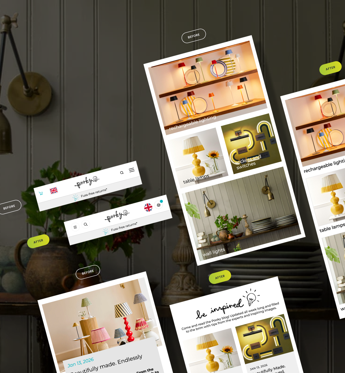
What we noticed about the original site
Before diving headfirst into UX design changes, Tom took some time to get familiar with how the current site works, especially on mobile devices. And while at first glance, the Pooky website has strong visual foundations, there are a number of UX details working against it. Inconsistencies in navigation, legibility issues in key sections and a lack of early reassurance made the experience feel less polished than it should. These issues don't necessarily stop users outright, but they do introduce friction and quietly undermine trust. And when it comes to ecommerce, those first few moments matter enormously.
Navigational elements feel inconsistent, key content is harder to scan than it should be and important information is either difficult to read or becomes clear too late in the user journey. Individually, none of these problems are deal-breakers but together, they create unnecessary friction at critical moments. These are the kinds of subtle UX issues that don't always show up in analytics, but have a significant impact on engagement and conversion every day.
Here's what we changed and why
1. Streamlined Navigation Icons
Pooky's navigation icons vary in size and visual weight, creating an unbalanced header and disrupting the visual rhythm. This inconsistent iconography increases cognitive load and as a result, users have to work much harder to scan information and recognise navigation options, making the header feel chaotic and less refined. For a brand that prides itself on elegant and sophisticated design, this is really concerning. To rectify this, Tom's design ensures standardised iconography sizes, stroke weights and bounding boxes to ensure visual consistency across the navigation.
2. Redesigned Category Cards
Tom quickly identified that the text over category cards sat directly on top of busy imagery, vastly reducing contrast, legibility and impacting accessibility. Poor readability slows users down and risks them missing key categories entirely, especially on mobile devices or in bright environments. To resolve this, Tom separated category titles from imagery by positioning text below the image to improve the overall look and feel with a few nifty UX tweaks.
3. Improved Blog Cards
As many users land on the Pooky website via their blog thanks to their brilliant content and inspiration, it's key that this page instantly captures user attention. Unfortunately, the typography hierarchy within blog cards feels unclear and excessive vertical spacing means only one blog post is visible at a time on mobile. As a result, users struggle to distinguish between blog post titles and excerpts, making their next step very unclear. To improve blog posts, Tom refined the typography hierarchy by implementing clear titles with optional excerpts. Additionally, by reducing card height to allow multiple blog entries to appear on mobile, content discovery is also improved and the page looks much more rich and inviting.
4. Boosted Product Visibility
Pooky's homepage features limited product visibility, delaying access to the website's core commercial content that it needs to promote in order to drive conversions. As a result, users may struggle to understand the product range or feel less than confident continuing their journey, increasing the risk of early exits and abandoned sessions. Tom introduced product-led sections higher up the page with features such as featured ranges, most popular and new arrivals, to immediately reinforce what the brand sells. Displaying products early on in the user journey aligns with user intent as it shortens the path to purchase. Not only that, it also reassures users that they're in the right place and helps anchor the experience around the brand's primary purpose, which is to sell more lighting.
5. Prominent Trust Signals
The existing Pooky homepage doesn't clearly display trust signals such as reviews, guarantees or credentials. For first-time visitors, this creates uncertainty around quality, service and reliability, all of which can prevent conversion. That's why Tom introduced visible trust signals throughout the homepage, including customer reviews, delivery assurances, guarantees, press mentions and awards. As trust signals reduce perceived risk and increase confidence, it instantly improves the user experience and creates a more enjoyable shopping journey.
The key takeaways
While the changes we've made may seem fairly insignificant on their own, together they significantly elevate the ecommerce shopping experience for Pooky. By improving consistency, clarity and trust across key customer touch points, the homepage becomes calmer, more intuitive and more commercially effective. This is where good UX delivers real value.
We hope you enjoyed this UX overhaul! We'll be doing a UX redesign every month, choosing a real ecommerce website and showing how clever UX design can create a smoother, more effective experience. Got a site you think we should take a look at? Send it our way. And if you're wondering what a full Limely-designed UX could do for your own site, you know where we are. It doesn't matter whether your existing site is built on Shopify, Magento, Hyvä or something else, we can work our magic on any ecommerce platform.


