


Welcome back to our series of redesigning existing websites with our UX expertise!
Each month, our UX designer Tom, is taking an existing ecommerce website and transforming it with UX design thinking. No client brief, no pitches, just a little design fun rooted in robust UX strategies. This time around, Tom turned his attention to H.Samuel, a well-known high-street jeweller that you’re likely familiar with already.
With such a huge presence in the jewellery space, you’d expect their online store to sparkle just as much as their products. But after a frustrating attempt at buying a watch for his father-in-law, Tom realised the H.Samuel site was in need of some serious polish. So, what happens when you take a jewellery site that feels more like an out-of-the-box theme and give it the luxury treatment it deserves? Let’s find out…
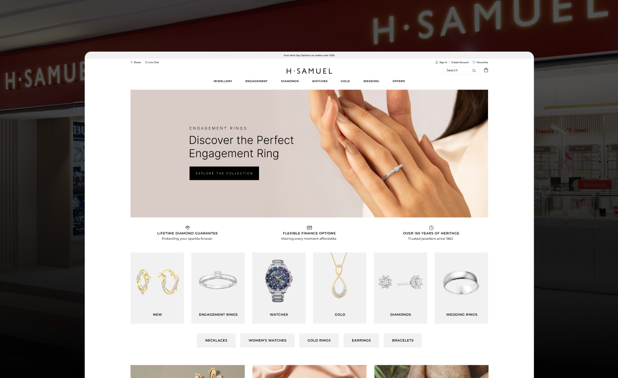
What we noticed about the original site
For a brand that’s been trusted on the high street for generations, H.Samuel’s website feels utterly underwhelming. The web design is cluttered in places and broken in others, the filtering doesn’t expand (making it practically useless), navigation feels very clunky and key selling points like free next-day delivery aren’t promoted anywhere on the site. Instead of a refined jewellery shopping experience, it feels like a basic website template that’s been hastily thrown together.
“Trying to buy a watch was infuriating. The filters didn’t work, the navigation felt messy, and nowhere did it tell me about perks like free delivery. The site just isn’t living up to the brand expectation.” – Tom, UX Designer
This insight shaped the redesign. It wasn’t just about making the site prettier, it was about creating a smoother, more intuitive shopping journey that reflects the prestige, heritage and trust associated with jewellery retail.
Here’s what we changed & why
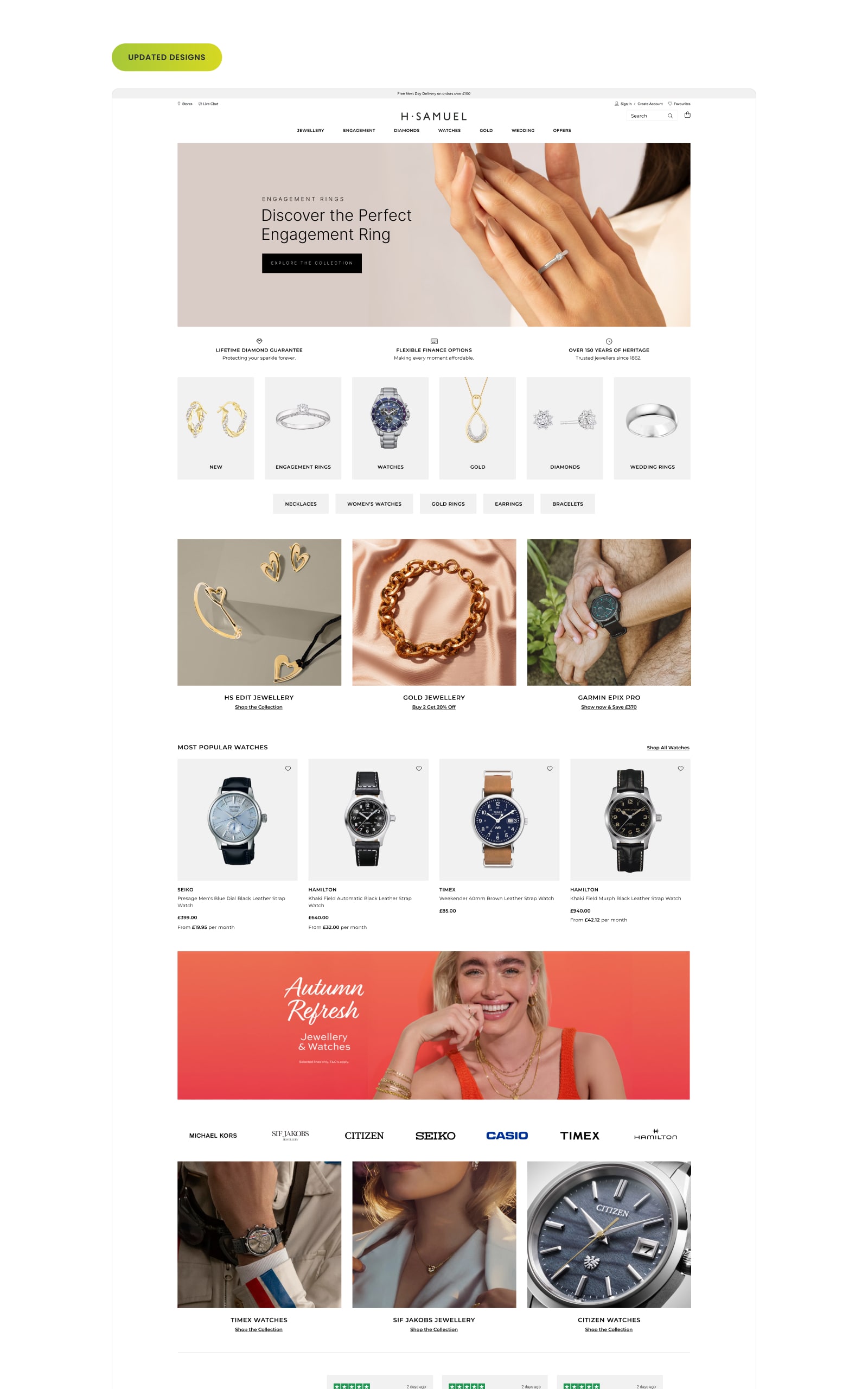
1. Polished Navigation
The navigation was tightened up and simplified, with clear categories that reduce the cognitive load on users. A top bar was added to highlight free next-day delivery, a huge selling point that was previously hidden, instantly building trust and urgency.
2. Hero Banner
We introduced a large, elegant hero banner to set the tone from the first click. Jewellery is an emotional and aspirational purchase so the hero space needed to reflect that with bold imagery and refined copy that immediately elevates the online shopping experience.
3. Rethinking Category Placement
The existing category banner sat too high on the homepage, pushing products down the fold and inhibiting a seamless, intuitive user journey. Therefore, we moved it further down the page, ensuring users instantly see striking visuals and featured products first, creating a stronger first impression and encouraging users to delve further into the site.
4. Product Showcase
Products were introduced higher up the homepage with revamped product cards that truly celebrate the beautiful products H.Samuel is renowned for. By including a ‘most popular’ section on the homepage, users can instantly begin browsing, without hesitation. Reducing customer frustration and leading to a more enjoyable shopping experience. Not only that, this section can be adapted to promote seasonal products that coincide with Christmas, Valentine’s Day and more, for a much more engaging homepage.
The individual product cards have also been revamped by introducing hierarchy within product titles (Brand, Type, Name) to make browsing smoother, while a cleaner layout and high-end styling make the products shine. Additionally, showcasing the monthly instalment cost below the total price helps users to quickly decide whether or not a product is affordable for them, improving customer satisfaction.
5. USP Bar
Surprisingly, H.Samuel didn’t mention their unique selling points anywhere on their website. Therefore, we designed a dedicated USP bar, highlighting perks like free delivery, warranty and click & collect options. Helping to build customer confidence and encourage online conversions.
6. Brand Section
While H.Samuel stocks a range of well-known brands, only a few of these leading names were mentioned online. That’s why we’ve incorporate a dedicated brand showcase section, helping customers quickly find what they’re looking for while reinforcing trust and credibility.
7. Reviews
Previously, H.Samuel didn’t have reviews, customer testimonials or star ratings anywhere on their website. By introducing a TrustPilot widget on the homepage, we are able to showcase glowing reviews from satisfied customers and in turn, improve customer trust and likelihood of conversion.
7. Fixing Broken Features
Broken filters made searching within the website an uphill battle. In our redesign, filtering was made fully functional and mobile-friendly, ensuring users can narrow down products by price, metal type, gemstone and more, just as they’d expect from a heritage jewellery retailer.
The key takeaways
This redesign was about restoring the sparkle to a household jewellery brand. By introducing a polished navigation, highlighting USPs, revamping product cards and fixing broken features, we created a site that feels worthy of the H.Samuel name. Instead of battling with clunky UX and hidden perks, customers are now guided through a smoother, more luxurious journey that mirrors the emotional significance of jewellery shopping.
It’s proof that when a brand with heritage invests in good UX, the difference is immense. We’ll be back next month with another redesign and if you’re struggling with a site that feels more ‘theme’ than ‘thoughtful,’ you know where to find us. Whether it’s jewellery, fashion, or flooring we’ll help your ecommerce experience shine.


