Whether you’re a bit of a design nerd or not (we’re guilty!), you can’t deny that company logos are fascinating. They tell a story, represent an entire company, and if they’re really good, define a culture.
Picture this. You drive into a town you’ve never been to before. Towering above you, somewhere in the distance, you see a pair of golden arches. You know you’re about to get a cheeseburger and a Coke. McDonald’s has one of the most recognisable logos on the planet, spread over 100 countries worldwide. It’s no secret that an iconic logo can make or break a business.
When famous logos change
Of course, not everything stays the same forever. Sometimes, companies make the decision (for better or worse) to switch up their branding. We’ve seen a massive influx of logo changes recently, especially in the tech industry. Usually, when one company changes its logo, all its competitors follow suit. However, we’re not particularly interested in the polishing-up of already decent logos. We’re going to take a look at the most dramatic changes our favourite logos have undertaken. A lot of them aren’t recognisable in the slightest!
Mozilla Firefox
The evolution of the Firefox logo is certainly an interesting one. This cheesy bird design was created back in 2002 when the Mozilla-owned project was known as ‘Phoenix’. Yep, we think it looks like a regrettable tattoo, too. In 2003, the company introduced probably the most familiar logo – the one in the middle. The one on the right is the most current version, updated in November last year. It’s certainly the cleanest, simplest and definitely our favourite.
Canon
This is probably one of the most dramatic logo changes we’ve ever seen! The Japanese camera imaging company was launched back in the 30s as Precision Optical Industry Co. At this time, the first prototypical logo was the one you see on the left here. Interestingly, it was inspired by the Buddhist Goddess of mercy, Kwanon. On the right, you see the logo we know and love today, introduced in 1956. It was apparently a ‘meticulous’ design process but it has definitely stood the test of time.
Pepsi
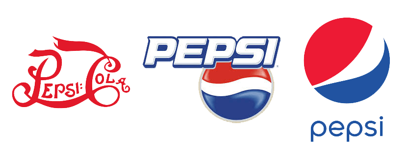
Cola-flavoured drink brand Pepsi has had more logo changes than we’ve had hot dinners. But we decided to whittle the designs down to just three of our favourites. In our opinion, the three logos you see here are among the most iconic. The first red script logo was created in 1905. After many, many changes, the most familiar logo in our eyes is the middle one – designed in the late 90s. Now, we’ve got the one on the right, a cleaner, subtle version that still very much represents Pepsi down to a T.
Apple
Okay, so the Apple logo has undergone quite a few changes, too. The original one is the most interesting, however. We’re not reeeally sure what the design guys were thinking in 1976… all we know is they were depicting Isaac Newton sitting under a tree. Very clever. However, just a year later, the iconic rainbow-coloured ‘bitten apple’ was born. It was very fitting for a company who were about to launch the first computer with a coloured display. This colourful design went entirely black in 1998 and then took on a 3D metallic look soon after. Today, the company has reverted back to the simple, flat design. It’s mostly seen in white and grey.
Which is your favourite?
For us, there’s nothing more culture-defining than the Apple logo. However, the nerds within us are pretty smitten with the new Firefox logo, too. Let us know your favourite logo and which change surprised you the most! And if you feel like your own logo needs a little shake-up, don’t hesitate to get in touch. We’ve got two experienced and pretty savvy designers ready to spruce up your branding. Contact us here for more info!


