


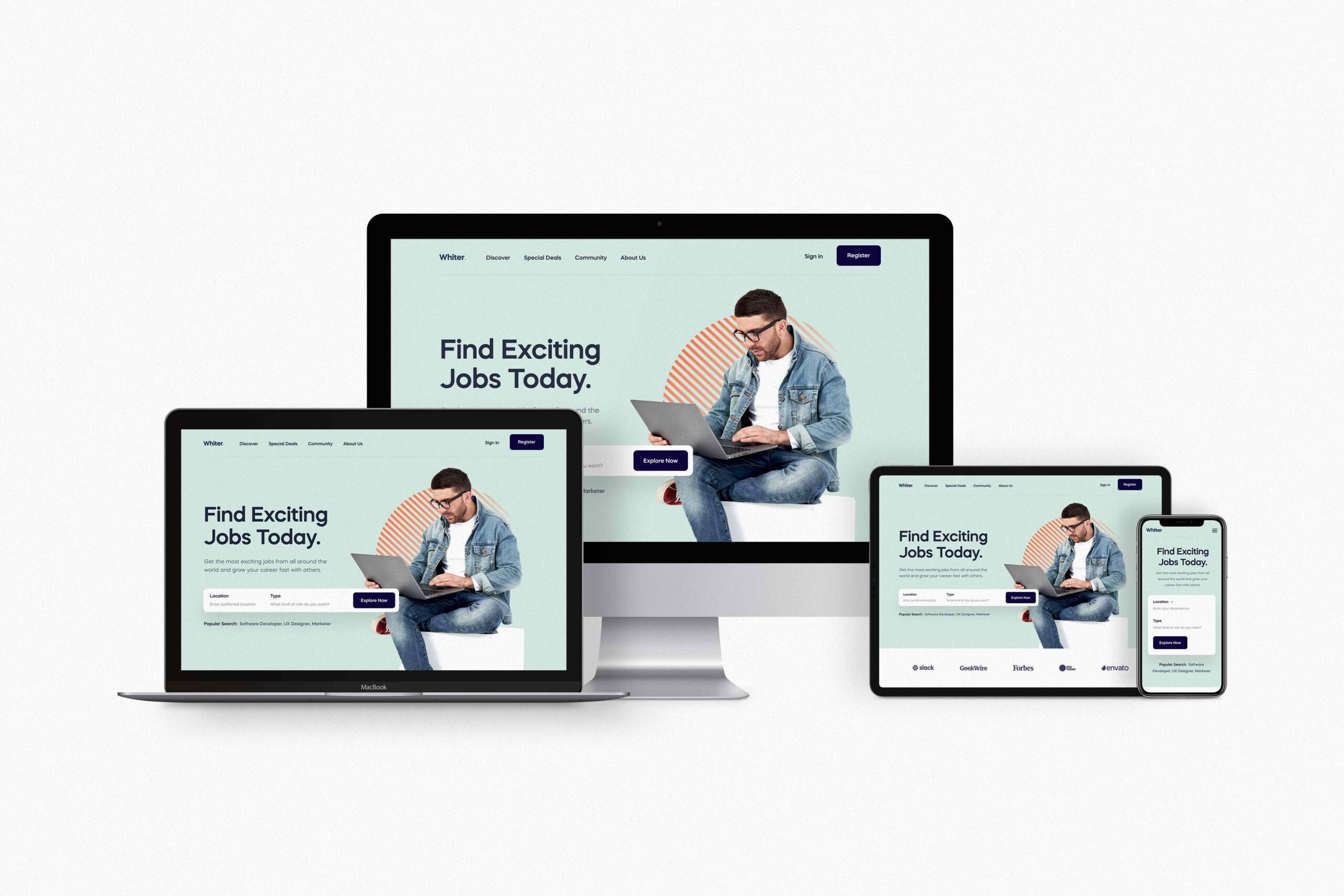
Responsive web design is becoming increasingly important!
Responsive web design ensures that websites adapt and respond seamlessly to various devices and screen sizes. As the landscape of devices users utilise to access the web continues to grow and evolve, web designers and developers must adapt to ensure they deliver a consistent user experience across all possible platforms.
Whether you’re a business owner, web designer or you’re simply curious about the world of responsive web design, we’re about to unravel everything there is to know about this approach to designing websites!
What is responsive design?
Responsive design describes the process of creating a website that has the capability of dynamically adjusting its layout, content and functionality to optimise readability and usability across any screen size. In technical terms, responsive design involves the strategic use of flexible grids, fluid layouts and media queries to adjust the design of a website, whether it’s being displayed on a smartphone, tablet, desktop or any other device. Responsive design creates a seamless browsing experience for all and in turn, increases user satisfaction, improves accessibility and leaves a positive impression on site visitors.
What are the benefits?
Responsive design offers a range of advantages that can take your website to the next level and ahead of the competition. Firstly, responsive web design can significantly improve the accessibility of your site for all users, regardless of their device preference. Websites that seamlessly adapt to different screen sizes and resolutions enable you to offer an inclusive experience for everyone and provides a consistent and intuitive interface across various platforms. Whether your audience is browsing on a desktop, tablet, or smartphone, they will enjoy a visually appealing and intuitive interaction with your website.
Another major benefit is the potential for increased mobile traffic. As more and more of us access websites from smartphones and tablets, a responsive design ensures that your website is always optimised for mobile devices, making it easier for users to navigate and engage with your content on the go. As a result, this opens up new opportunities to attract and retain a larger audience.
Lastly, Google rewards responsive designs with greater visibility and improved rankings as a result of Google’s mobile-first indexing system. By implementing responsive design, you not only enhance the user experience, you also boost your search visibility and drive organic traffic to your site – Win win!
How can I upgrade my website to be fully responsive?
Transforming your existing site into a fully-fledged responsive online experience starts with identifying key areas of improvement. Prioritising the implementation of a flexible grid system is absolutely crucial as this will enable your site to adapt to different screen sizes thanks to the responsive CSS grid system. Next, you must incorporate media queries into your CSS as this will enable your website to display different styles depending on device breakpoints set by you. Image optimisation should never be overlooked when it comes to responsive web design as this will enable a seamless experience with fast loading times. Finally, it’s key to test, test and test again!
As you can see, responsive web design is not just a trend, but a necessity in today’s digital landscape. By embracing the principles of adaptability and user-centricity, you can create a website that delivers a seamless experience regardless of the device or screen size a user is visiting from.
Need fresh creative on tap? Check out our design subscription — your plug-in design team for all things ecommerce.


