We think we’re safe in saying that we have the expert upper hand in this one.
You may think you have web design sussed. But we’re here to tell you that there are some aspects that some people have misconceptions about which without the right guidance can lead to ineffective websites that are, to put it straight, a bit naff.
So, we put some of the rumours to rest in order to put a stop to some of the most common assumptions people have as they venture into the world of web design.
“Minimalism is Everything”
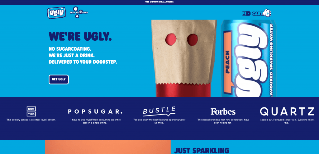
Erm, not necessarily. Don’t get us wrong, minimalism is nice and can bring your site that classic, modern look. But that’s the thing, minimal is not going to suit every business. Check out drinks brand, Ugly Drinks for example.
We think your site should be treated as a direct extension, made suitable for an online space. Hence why you need to make sure that your website is designed with your company in mind, and not just to keep up with the current trends.
“Content schomtent – that’s last on the list!”
Woah, definitely not the case! What use are great designs if you the words that surround it are a snore-fest, hard to read and difficult to understand? So, content should be sorted alongside the design so both can be at a high standard and work together in harmony.
But who’s better to write your web content than you? Well, that would be a copywriter. No, they don’t know the ins and outs of it as you do, but it’s their job is to be highly skilled in whipping up the right words that not only reflect your business but do well to entice and engage.
“Barely anyone is going to be accessing my site on mobile”
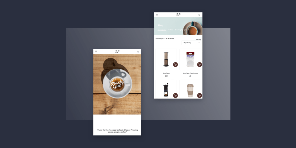
Surely you’ve seen how many of us have our phone as an extra limb. And with social media being so relatively available on our handheld devices with direct links to your site via marketing and whatnot, more people than you think will be using their phones to access your site, no matter your business.
This is why it is vital that your desktop site looks as good and performs as well on mobile!
“Obviously, the less stuff in the navigation menu, the better!”
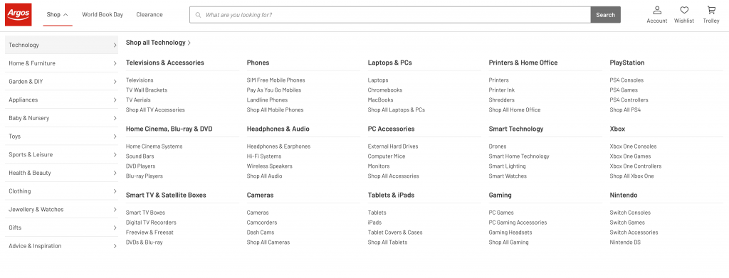
Well, in some cases this is true as a cluttered navigation bar can cause the opposite effect, making it harder for the user to find what they need. But sometimes, a mega-menu makes life easier. Some ecommerce sites can have an extensive range of products and product categories where there is no choice but to display as many options possible.
If you look at big ecommerce sites like Argos, you’ll see that they don’t shy away from the overly populated navigation bar – sometimes it’s just needed!
“Stock photos look so good, that’s all I need!”
The odd stock photo here and there can fill some gaps and contribute to your desired style, but filling your site with nothing but may decrease its quality and most importantly, trust from the user. The best thing you could do is fill your site with your own imagery, which could include pictures of your offices, HQ, team members or pictures of the products you work with or sell. This is the best way to truly represent your brand and evoke legitimacy and trust for potential clientele.
So, there you have it! They’re our responses to general misconceptions about the web design process. But to truly make sure that you aren’t making little misjudgements that could hinder your final site, just stick with Limely and you’ll have nothing to worry about.
Enquire today!


